I’m keenly interested in the design features of online health applications and the way people respond to different aspects of presentation and interaction. One of the things that triggered a set of questions for me was one of the websites I analyzed in my dissertation research, which offered detailed estimates of risks related to prostate cancer. This particular website has changed their algorithm (and design) in the intervening time, though the key design issue that interested me is still the same. (Note that I don’t want it to seem like this website is the issue here — there are many other similar websites out there and they all offer similar types of possibilities for estimates. This is just a convenient example.)
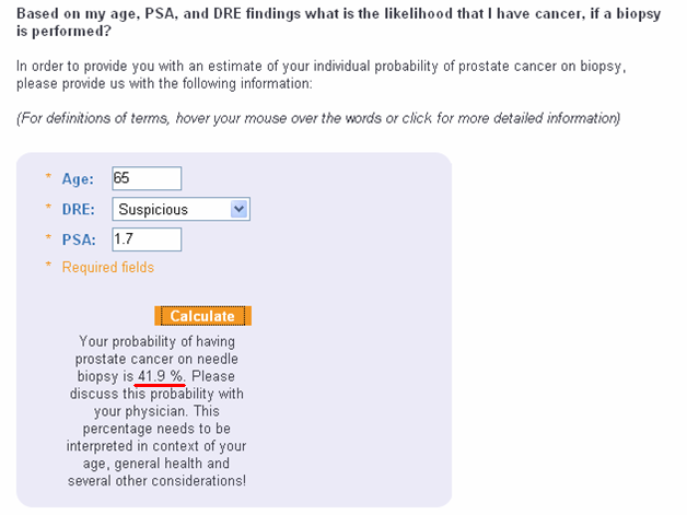
In any case, I was playing around with the application, and tossed in a few arbitrary pieces of information (65 years old, suspicious digital rectal exam, and prostate specific antigen of 1.7) and was rather surprised to find that, had I actually been that 65 year old man with these data, I would have been told I had a 41.9% chance of having prostate cancer. Not about 2 in 5, 4 in 10, 40 in 100, or 40%. Not even 42%, but precisely 41.9%. It surprised me so much that I took a screenshot:

I have since used this a couple of times in talks to illustrate the point that a lot of people design applications like this, but there is very little science upon which to base decisions about how to present results to users. Even if the developers manage to design for good usability (which, happily, more and more people are doing all the time), there doesn’t appear to be a lot of attention to the science of how subtle details can influence how users will interpret the data or information presented.
I know that the number 41.9% is based on mountains of carefully-collected data, and so the precision is actually defensible from a scientific perspective, but what does that level of precision mean to a man using the application? Does 41.9% convey more or better information than 42%? If he clicks around, and finds the screen that explains that the data upon which this estimate is based come from a series of nomograms in the Journal of Urology, and that the overall accuracy is 80%, is that meaningful? How is he supposed to use the 80% accuracy rating to interpret the 41.9% estimate? Does he understand what the estimate means? Does he even really want to know? And how does all of this depend on individual factors such as numeracy and decision-making preferences?
I have been thinking about these questions for a while, and was finally able to run a study looking at a piece of this issue. I submitted the manuscript recently, so stay tuned for some answers.


One thought on “Health Literacy, Numeracy and Risk”
Update: The manuscript is out, and I also presented our findings at a conference recently.
Paper: http://www.jmir.org/2011/3/e54/
Conference abstract: http://smdm.confex.com/smdm/2011ch/webprogram/Paper6629.html